Elemental is a training center with a personalized service approach.
The founders wanted to position the training center as an exclusive space, where each client feels unique. In addition, they brought personal references that are part of their identity: the world of basketball, the urban aesthetic of street art, and 90s visual culture.
Positions Elemental Performance as a guide and mentor, helping clients achieve their goals and become the best version of themselves
Positioned between the Hero and Sage archetypes, Elemental Performance embodies performance, strength, discipline, achievement, and action, while also grounded in knowledge, clarity, strategy, guidance, and wisdom.
The combination of the Sage and Hero archetypes in Elemental translates into a brand that blends technical knowledge with purposeful action, guiding clients with strategy and intent. It is not just about training, but about understanding the process and evolving with awareness—avoiding both directionless impulse and stagnation.
The color palette was defined based on research into color psychology, as well as the references provided by the founders.
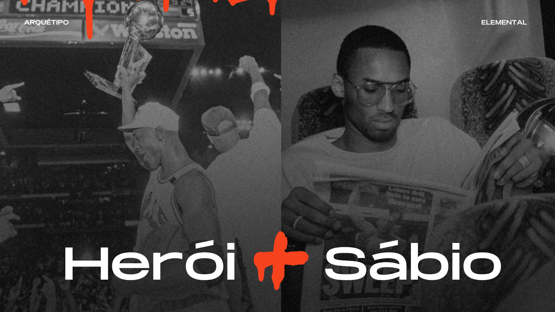
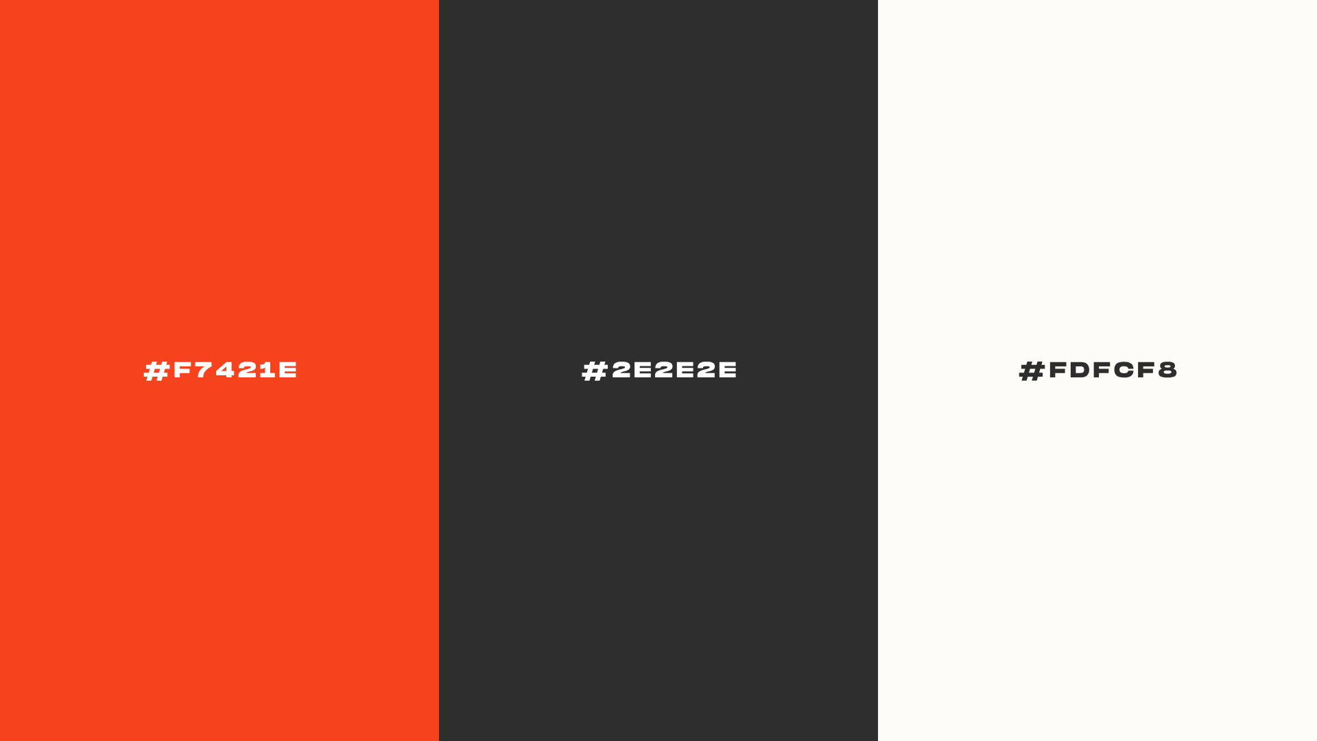
Orange was incorporated as a reference to basketball, while black and white are strongly rooted in 90s visual aesthetics.
In color psychology, orange conveys energy, action, and dynamism, reinforcing movement and physical activity. Dark gray communicates authority and technical expertise, while also creating contrast and adding visual weight to the identity. White, in turn, balances the composition—encouraging mental clarity and representing moments of focus and self-care within the training routine.
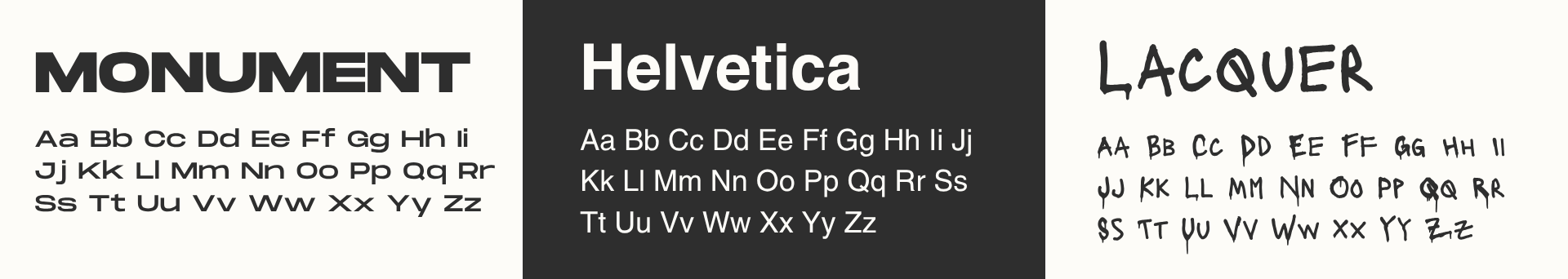
Color combinations were also tested to ensure effective contrast when used together.
The typography was carefully selected to balance impact and clarity within the visual identity.
Monument: It is a typeface with strong presence and high visual impact, making it ideal for headlines and highlighted text.
Helvetica:It is a typeface with high readability and legibility for social media, allowing the audience to quickly absorb the message. It is particularly effective for longer-form text.
Lacquer: A graffiti-style typeface that references street art aesthetics, ideal for use as a decorative element across visual applications.
The highlights were designed drawing from street art aesthetics, incorporating visual elements that strengthen the brand’s urban identity.
At the end of the process, a visual guideline was developed to ensure consistency in the application of the identity across social media.
This material provides guidance on the correct use of visual elements, ensuring consistency and brand recognition. As a result, the communication remains cohesive, regardless of who produces the assets.